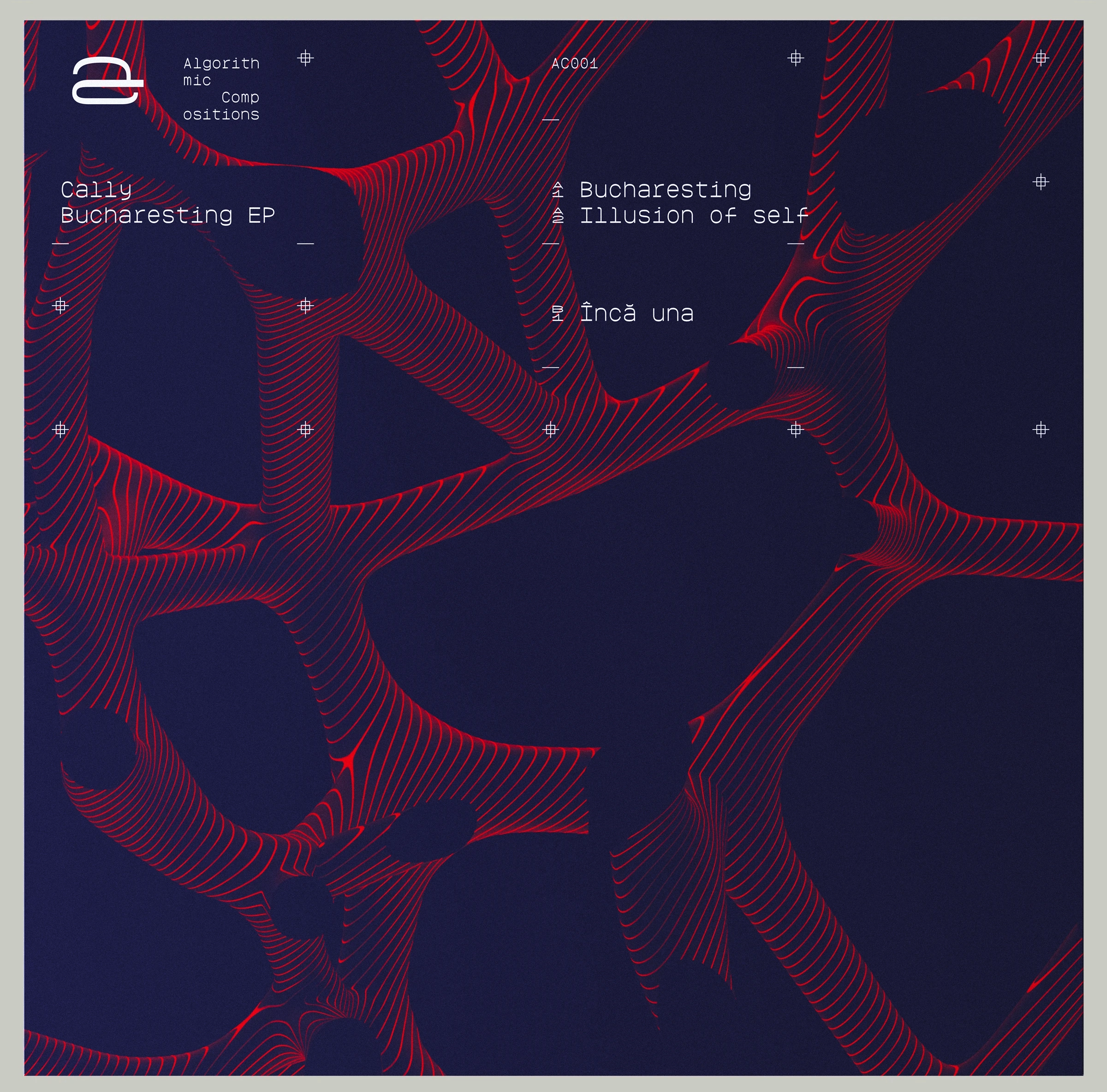
The System Behind The Artwork
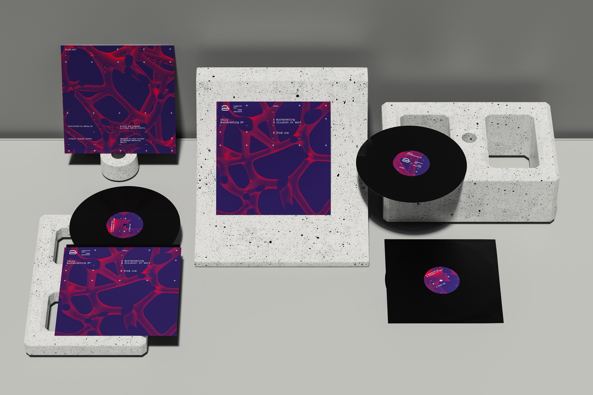
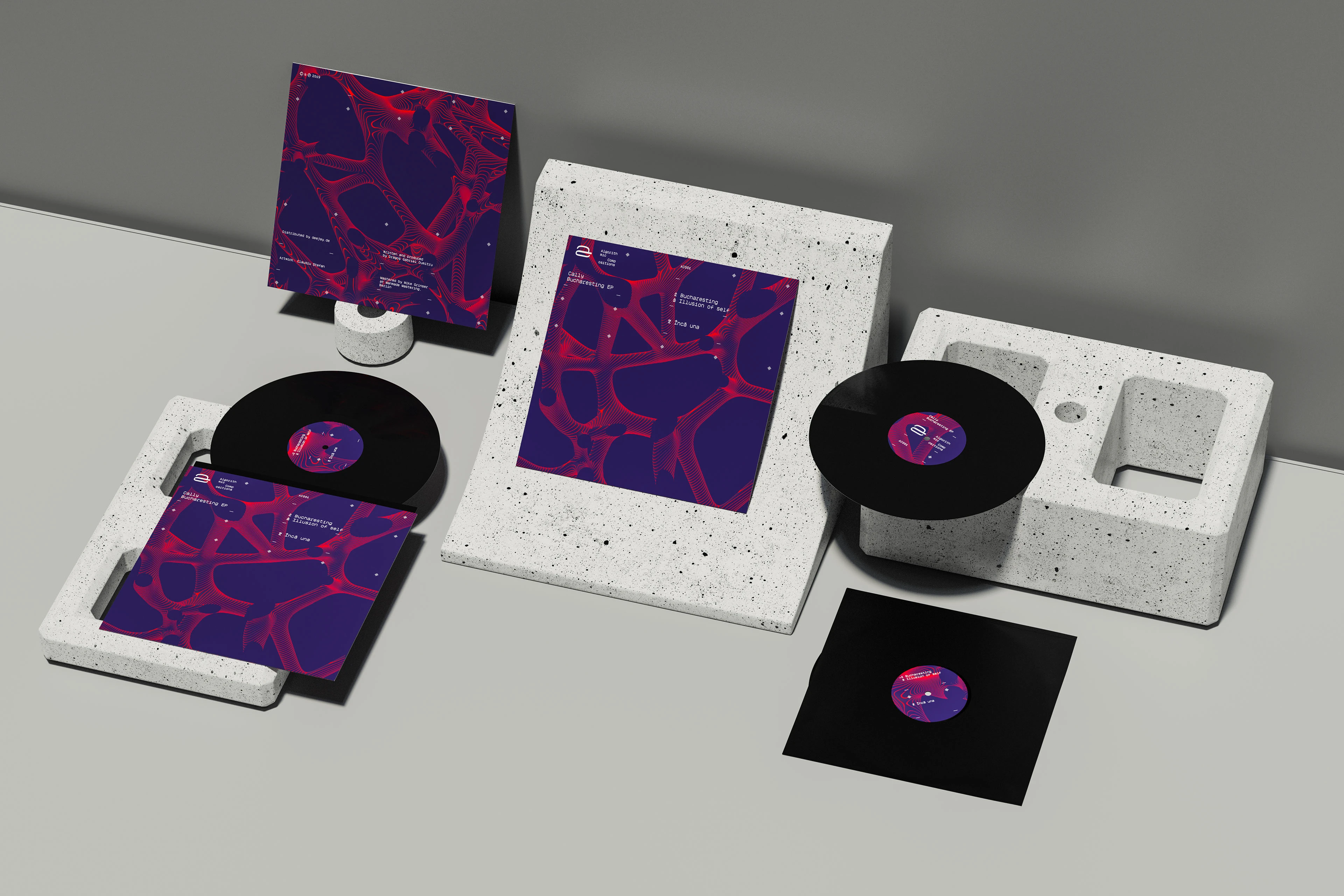
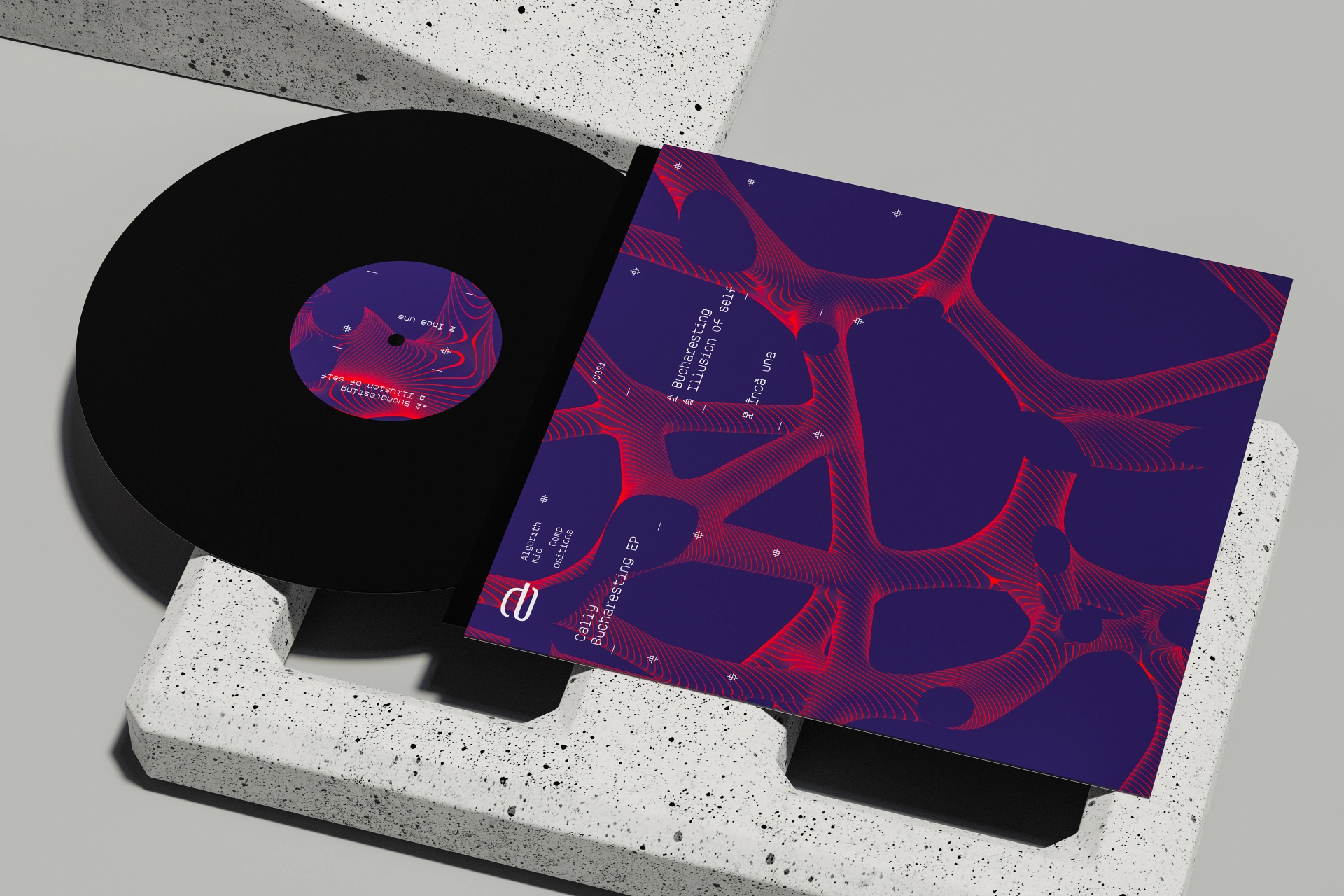
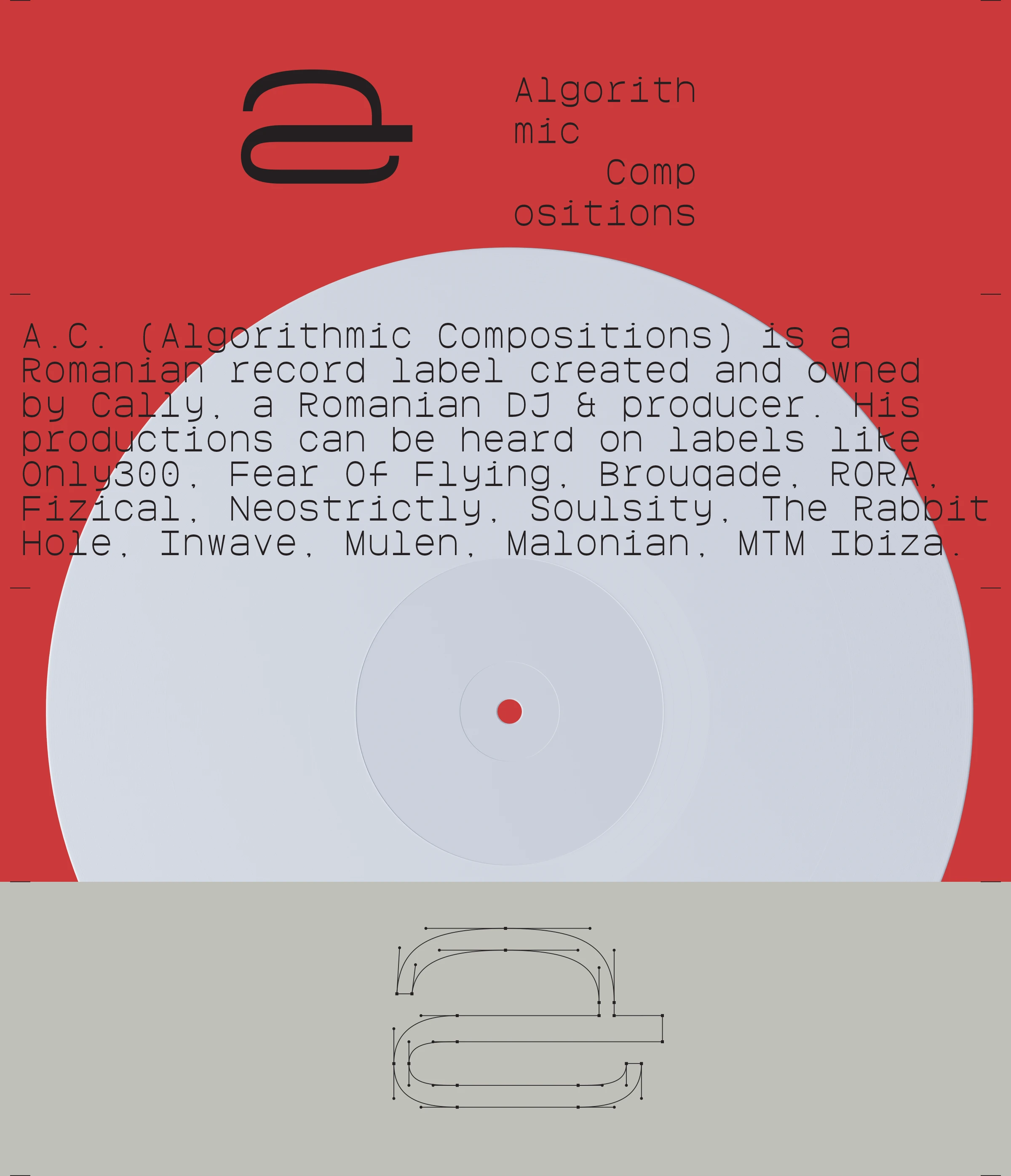
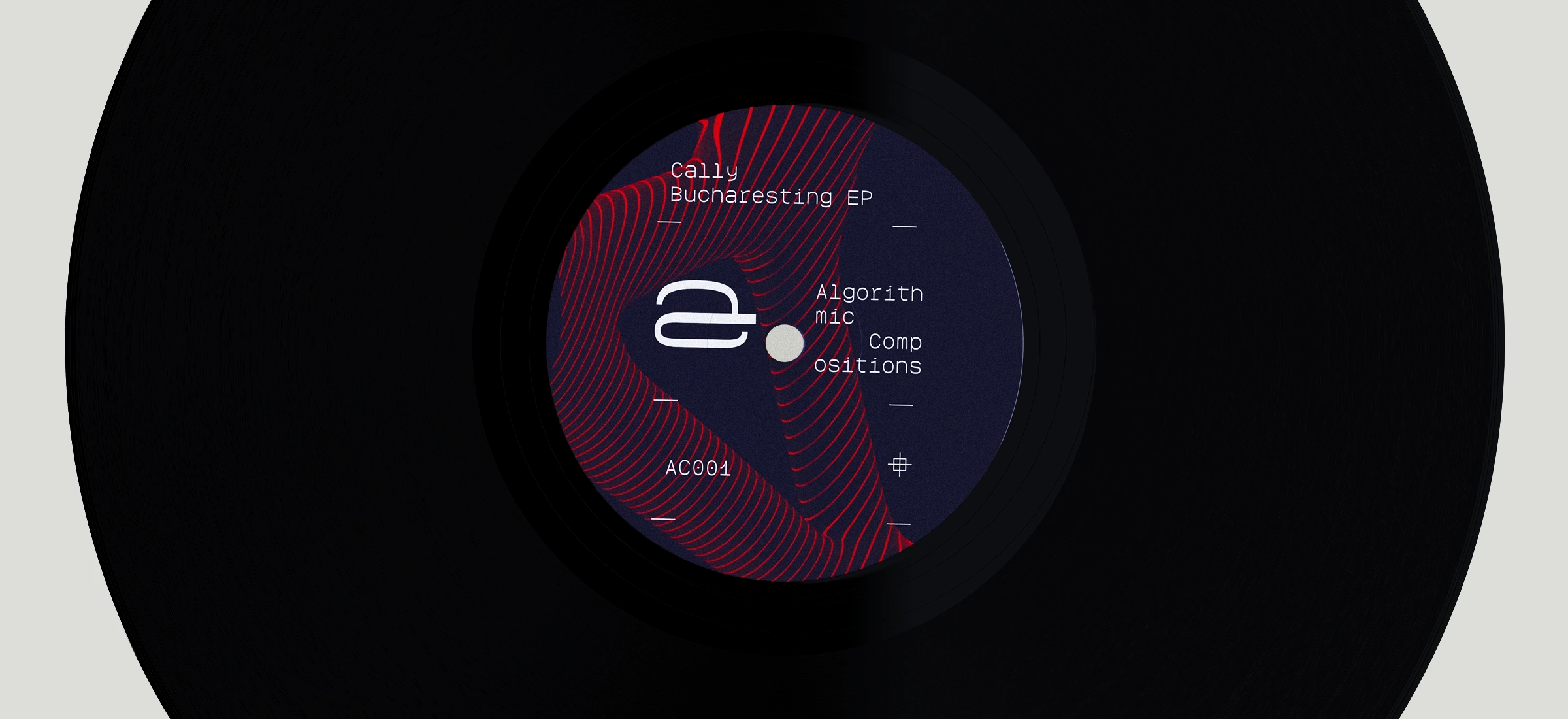
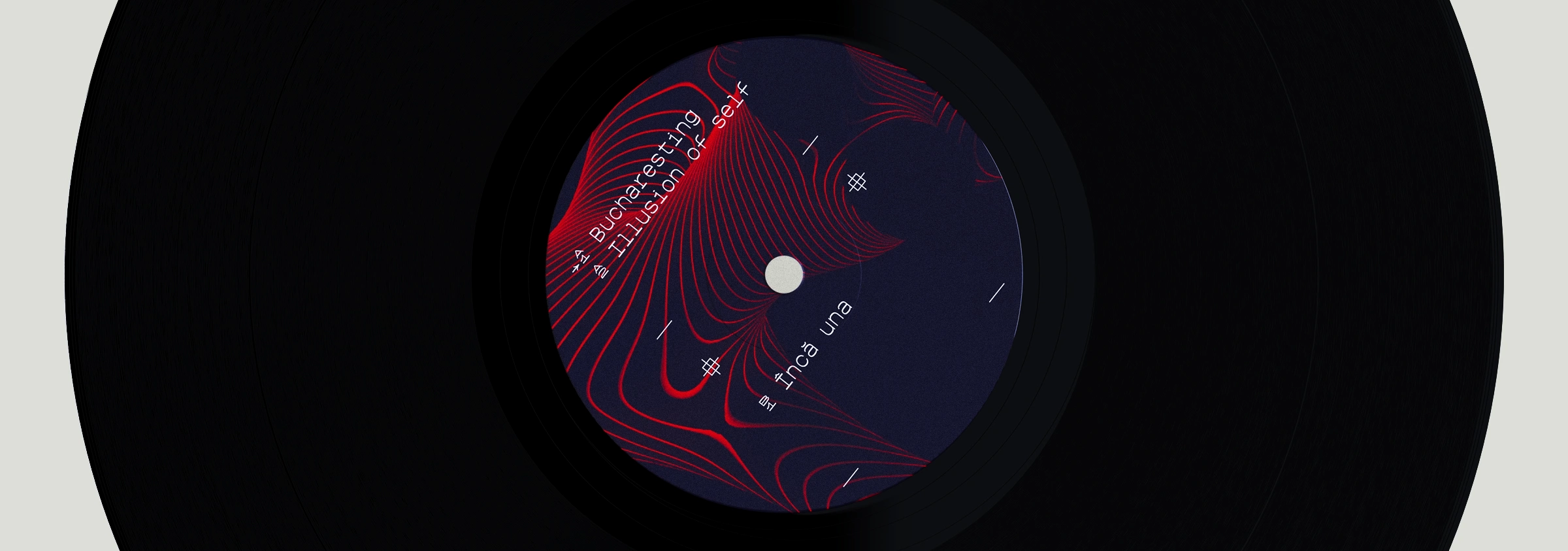
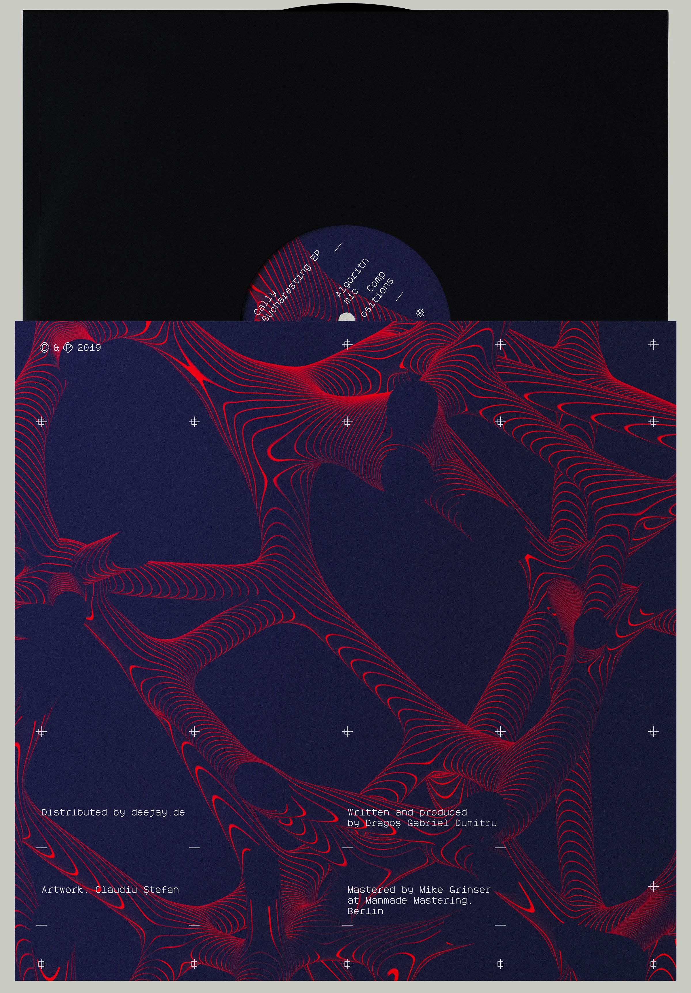
Grid Matrix: The layout spread across the record’s sleeve—a perfect square 4/4 space. This square is divided into four distinct columns, where the text is sequenced in the same modular fashion a track is arranged in production.
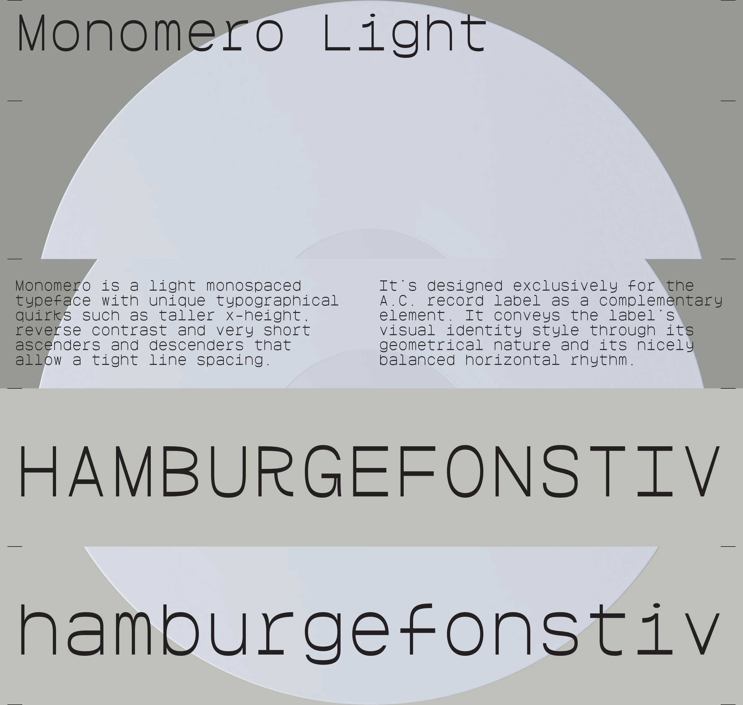
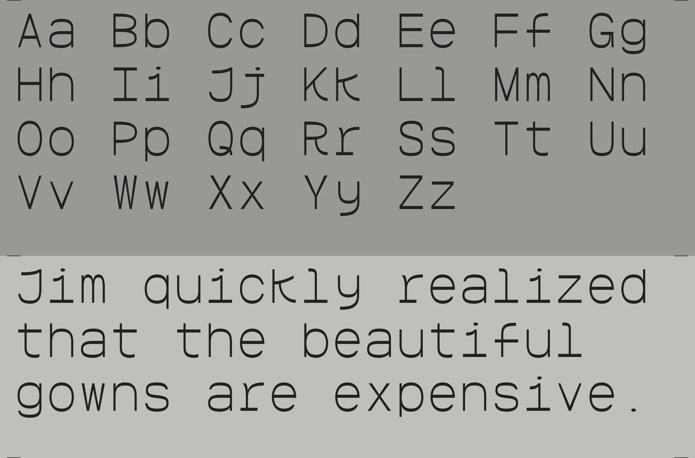
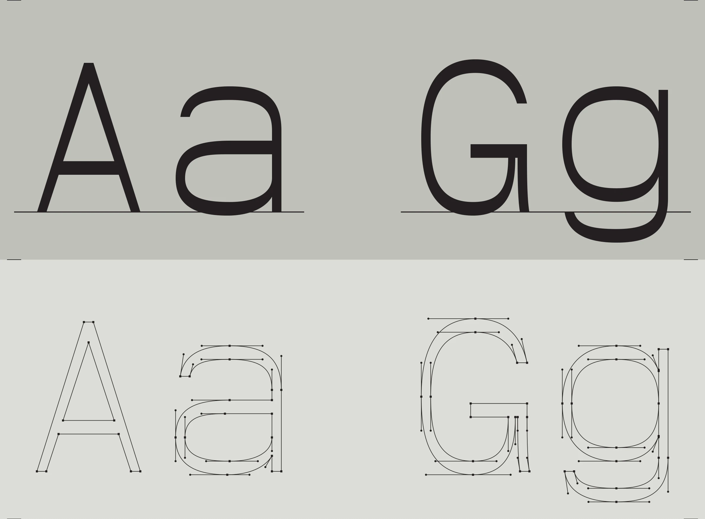
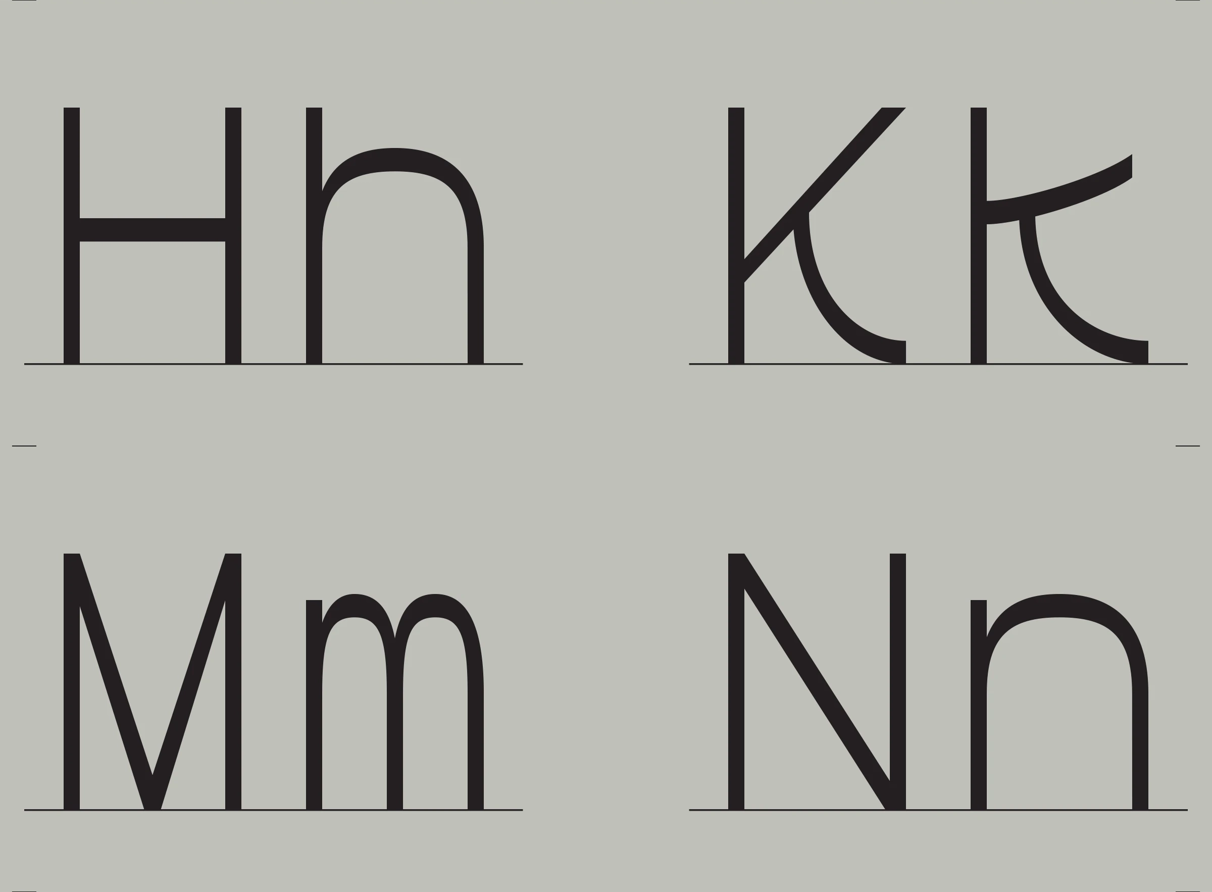
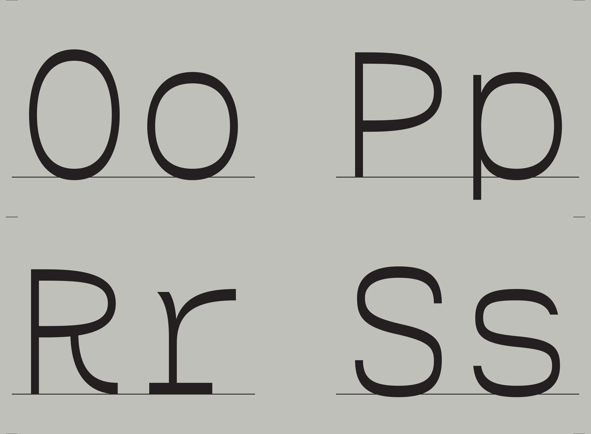
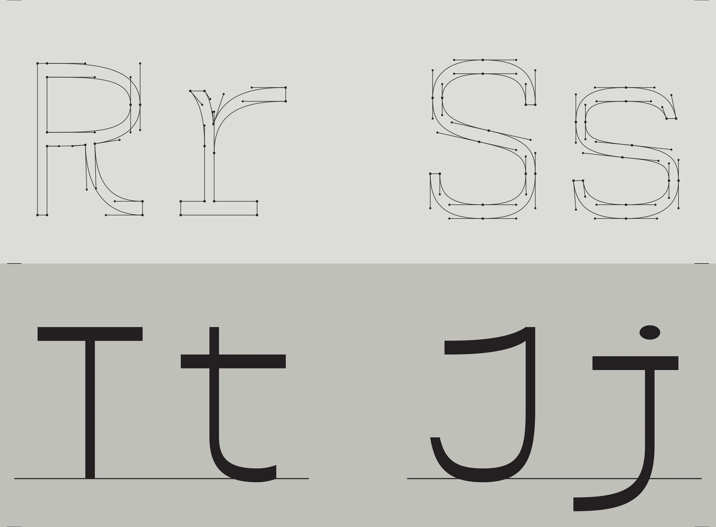
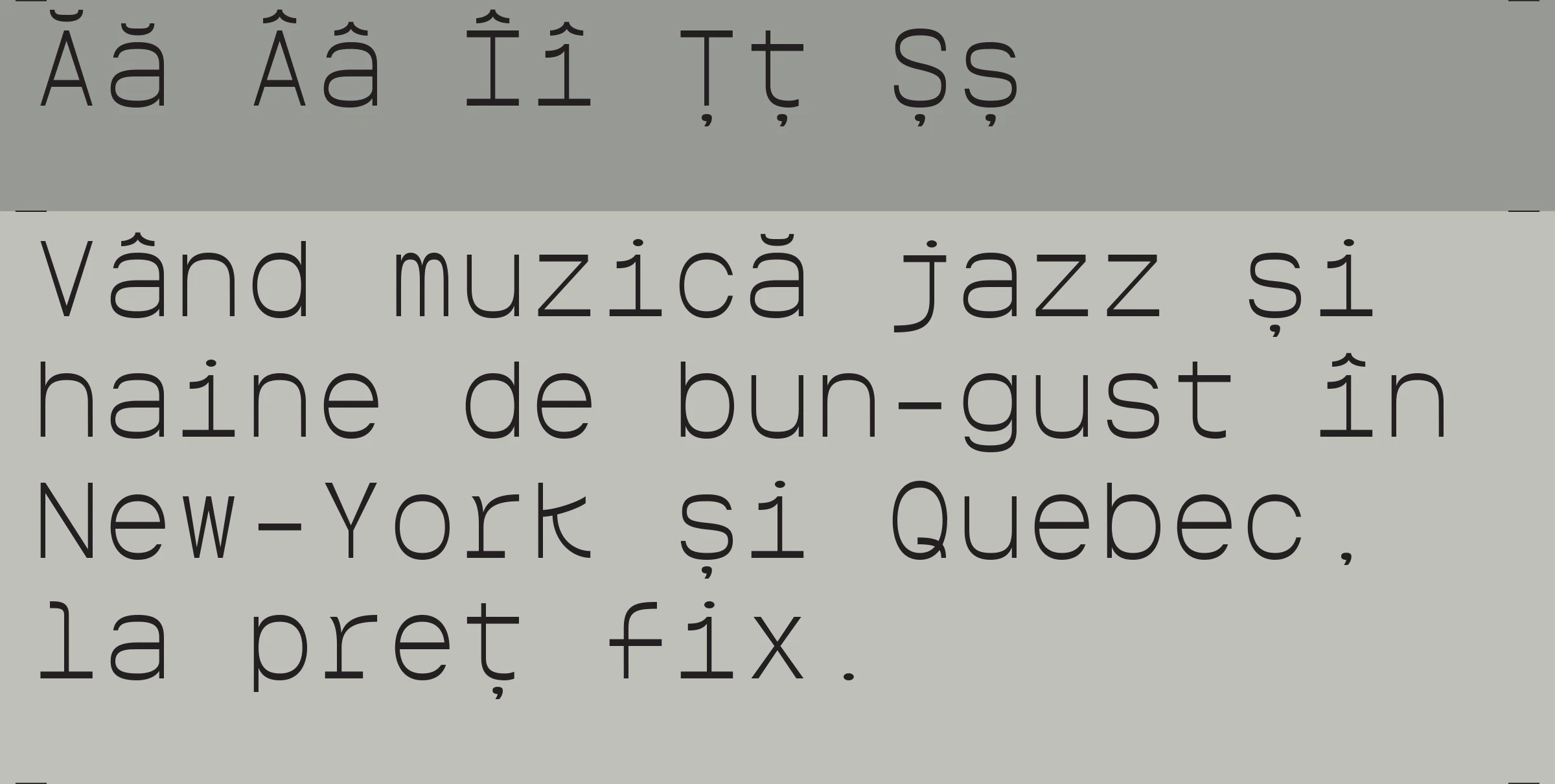
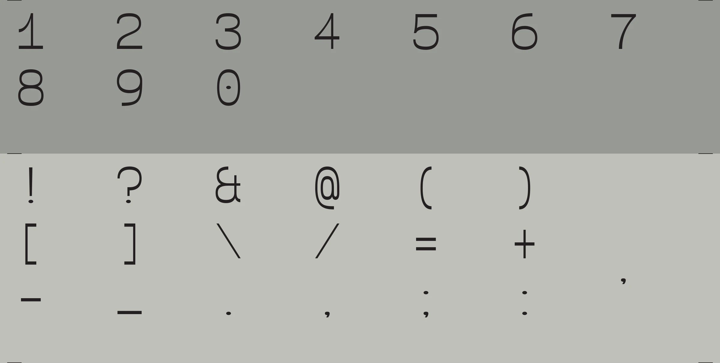
Typography: While the rhythm acts as a driver for melody and groove, the custom typeface takes exactly the same role. It is the steady clock-source that guides the eye through the artwork.
Background: Layered behind the grid are organic, wavy lines that form fluidly into 3D tissue-like structures. These shapes represent the influence an algorithm can have on the tone and the melody, describing the mood of each release.
Production & Constraints
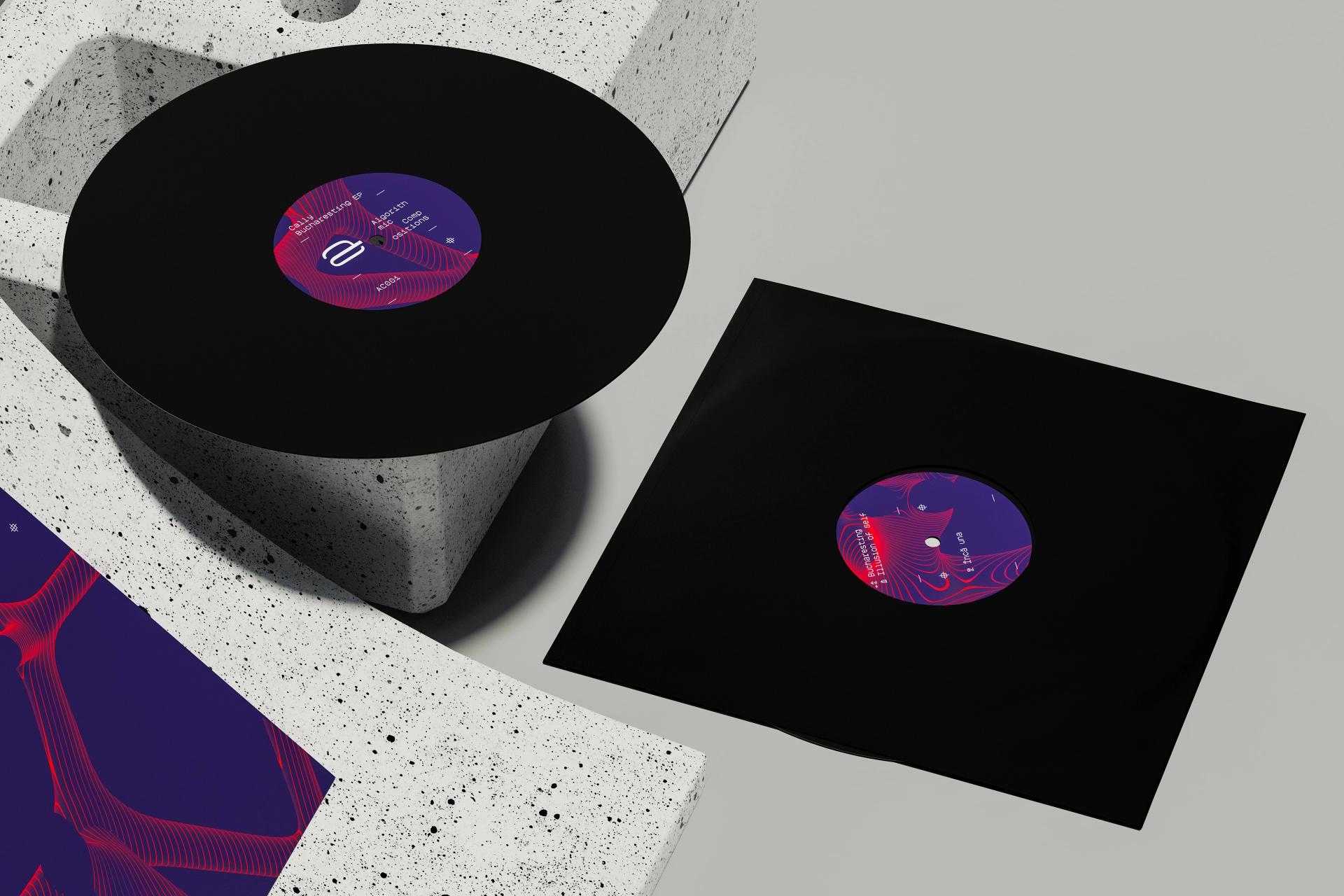
The Materials: The colors Pantone 2617 and Pantone 021 are printed on the uncoated side of standard sleeve packaging paperboard. Flipping the paper to use the rougher, reverse side is a common practical solution to get a premium, tactile feel without the high cost of specialty stocks.
The Budget Priority: For independent producers with limited resources, budget decisions are clear-cut: when the choice is between printing on expensive paper or pressing 50 more records, the decision leans almost instantly toward pressing more music. For this project, the investment was intentionally directed away from specialty paper and reallocated into custom colors and a bespoke typeface.
Why a Custom Typeface?
Unified Identity: It is a unique, single tool that makes the label identity immediately recognizable across all channels—whether in retail record stores, on social media, or in digital stores. It also keeps the visual system intact even if a different designer is commissioned to handle future artwork layouts.
Licensing Freedom: It is completely free to use across channels. While most commercial font foundries impose strict price caps and separate licenses for desktop, web, and social media use, a custom font permanently eliminates these financial liabilities—a crucial advantage for an independent label managing its own platforms.